
ChargeItSpot
A mobile app that helps users to find the nearest phone charging kiosk.
My Role
I worked as a solo Product designer to redesign the chargeitspot mobile app.
Team
Sheri Tate, SVP Product Strategy
Janelle Grace, Product Manager
Piyush Chauhan, Product Designer
Client
Duration
4 months
Tools
Sketch
Invision
Illustrator
About ChargeItSpot
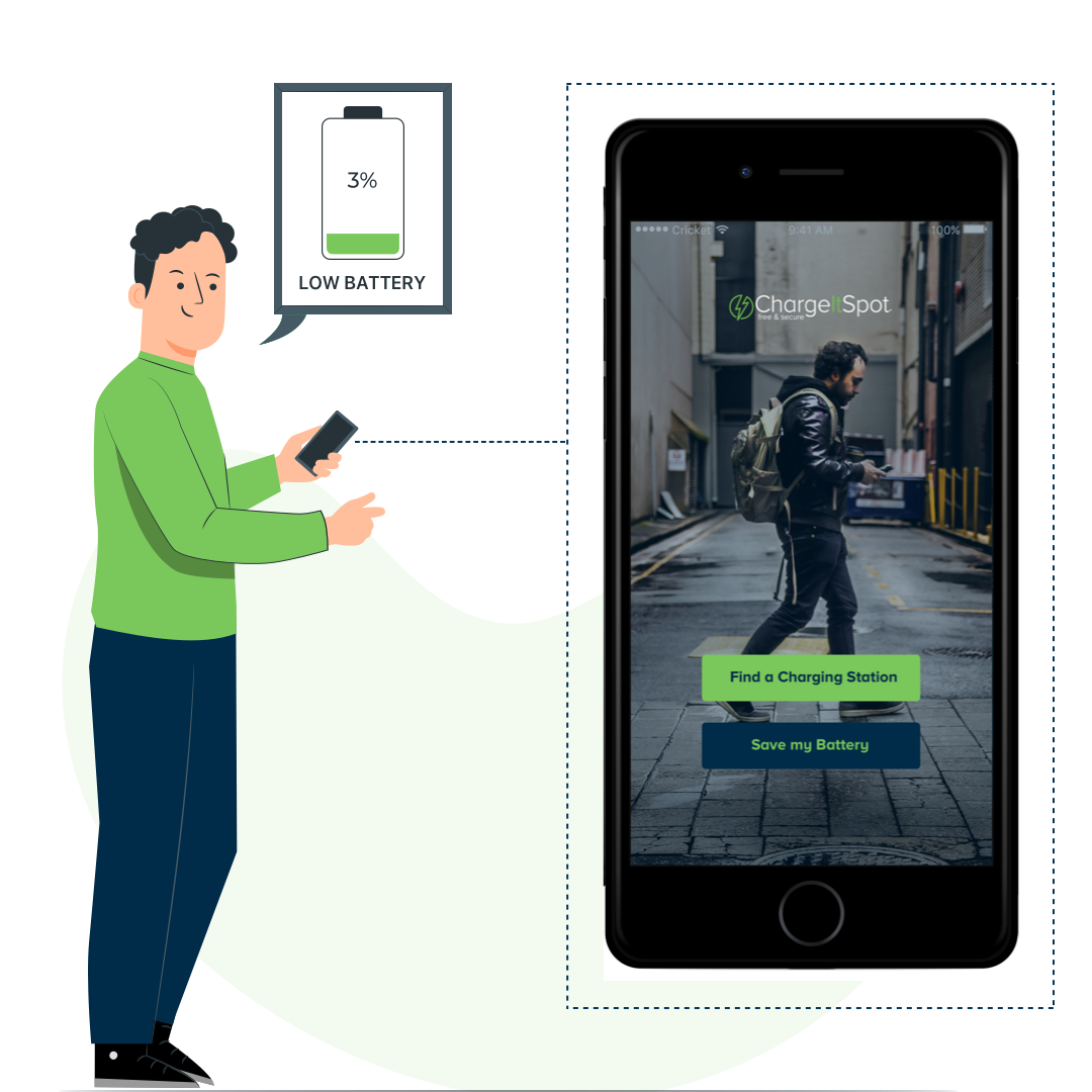
ChargeItSpot is the leading provider of phone charging stations for retailers and brands. Their mobile application alerts the user when their battery is low and directs them to a nearby ChargeItSpot kiosk.

Challenge Prompt
“How might we make it easier for the user to find the nearby ChargeItSpot kiosk when their phone battery is low?”
Process
Developed our product through following phases: Define, Discover, Design and Deliver
01. Define
Problem
Goal
PROBLEM
On October 2015, when the ChargeItSpot mobile app was introduced to the world to direct the user to nearby charging Kiosk by ChargeItSpot., users have privately and publicly expressed negative opinions about the ChargeItSpot mobile app. These views suggest that it’s hard to find the nearest charging Kiosk when the battery is low and leaving users in a problem state when there is no nearby charging Kiosk. It is not completely solving a user problem when user’s battery gets low. So it imposes a poor experience on customers. This can be the main reason why the users are uninstalling the ChargeItSpot mobile application. Over the years, several versions have been made to have a better finding for the nearby kiosk but new features have not been added to make it a complete battery saving application.
GOALS
Conduct a User Research to identify the pain points faced by the potential app users.
Analyze the data collected from the user research and ideate possible design solution to the problems discovered.
Designing work flow, wireframes and mockups to articulate the design solution.
Create a working prototype to illustrate and validate the designs with users.
Conduct a Usability testing to gather feedback from the user and make further improvements.
02. Discovery
Current Application Overview
Competitive Analysis
User Research
User Personas
Brainstorming
CURRENT APPLICATION OVERVIEW
The arrow key seems like a button that goes to the next screen on tapping.
Although circles at the bottom help direct the user to the next screen.
Copy and Circles are too close to each other.
When the user taps on any station, it doesn't move the screen to the center.
We can make the position and shape of the Locate me icon consistent with Google Maps.
Huge amount of space dedicated for a link to Insta photos.
Header blackout whenever user opens an application for the first time.
Bottom banner looks like an ad.
Instead of miles, we can show distance in ft or time + distance.

COMPETITIVE ANALYSIS
Brightbox Application
Pros
Homescreen lands to map
No separate filter for list
Clear info on how to use
Search icon for Search
Cons
Only focus on nearby charging locations
No direction for Maps
Show miles for distance

Ankerbox Application
Pros
Clear icon for “locate me”
Icon for showing nearby location in a list
Hamburger menu has lot of options
It has more security with User Account
Cons
User has to turn on the Bluetooth to use this application
Bottom image looks like an Ad

Similar Apps to lookout

USER RESEARCH
The goal of user research was to empathize with the users, their goals, expectations and frustrations. In order to accomplish this, we gathered relevant data by conducting interviews of 15 users.
Among the 15 participants we interviewed, there were 7 females and 8 males.
5 of the total number of participants had used the ChargeItSpot charging station before while the rest 10 participants had never used the station or mobile application.

USER PERSONAS


BRAINSTORMING
Features on scale 1-5
Participants rated the below features on the scale of 1-5 on being asked in the interview.

03. Design
Initial Workflow
Wireframes
Final Design
Use cases
INITIAL WORKFLOW

WIREFRAMES

FINAL DESIGN

USE CASES
FINDING A CHARGING STATION
Users can open the app and can choose the type of option they are looking for.
If the users are looking specifically for phone charging kiosks, the first option will redirect the users to the map screen.
If the users are just looking to save their battery, the second option will direct the users to the battery tips screen.
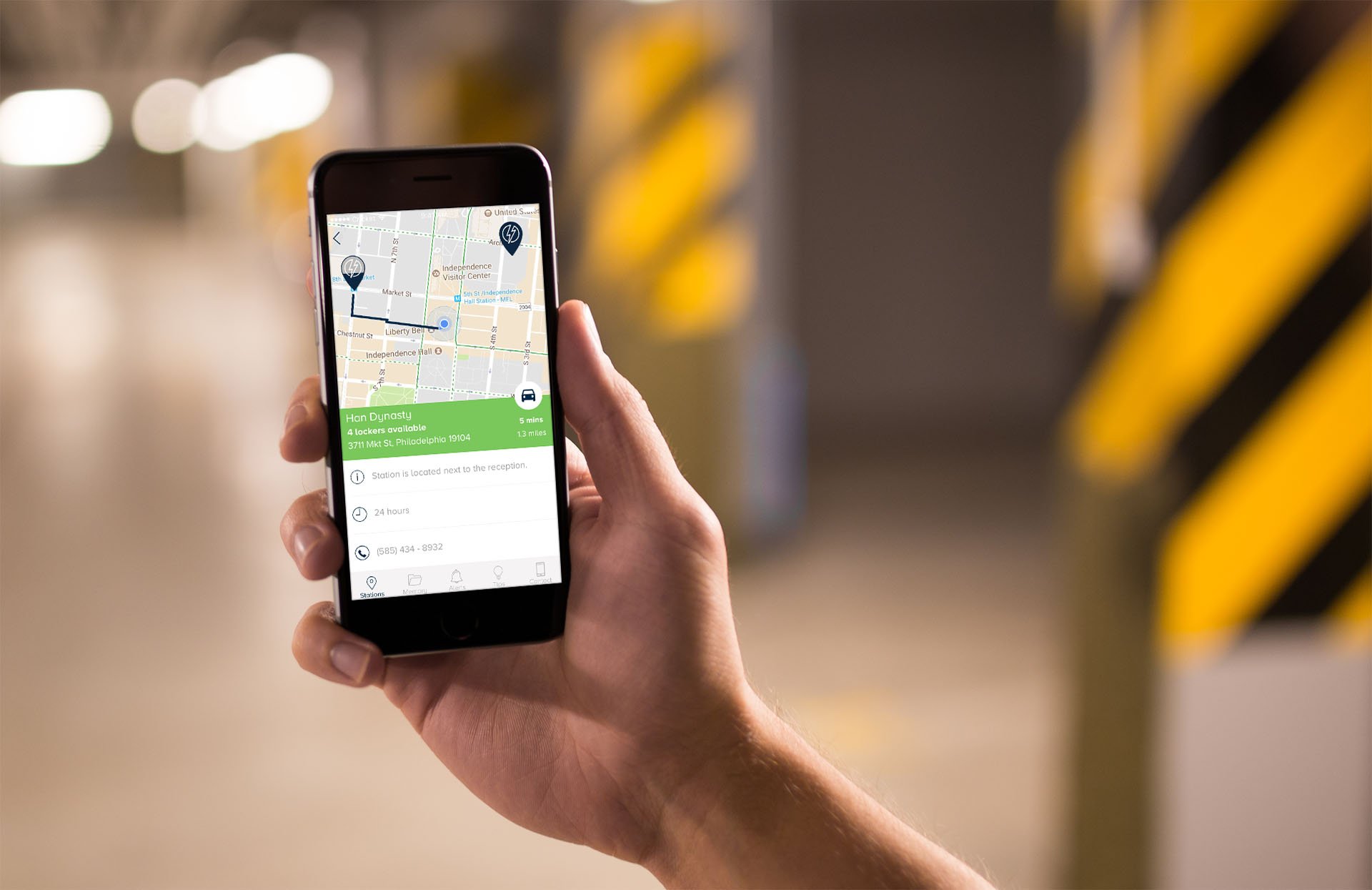
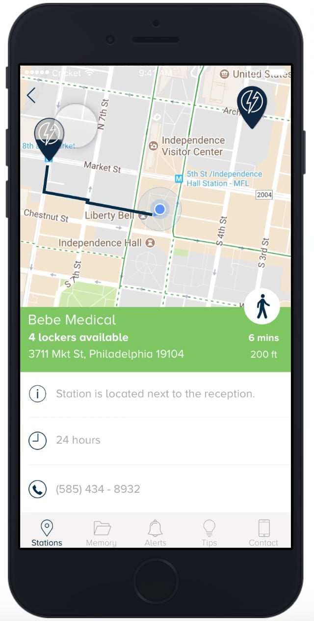
INFORMATIVE MAP SCREEN
The amount of Markers filled tells the user how many lockers are unoccupied and available for them to use. The more the better.
Once the user taps on any of the markers, a pop up will tell the user how many lockers are available and with that user can connect the visual marker with the number of lockers availability.
It helps the user to see on the first go that how many lockers are available(free to use).
List icon at the top right shows the nearby charging station to the current location of the user.
MEANING LIST SCREEN
The app shows walking icon directions to the user on the station detail screen if the nearby charging station is less than a mile.
Similarly, if it is greater than a mile it will show users driving direction and time accordingly.
This condition has been mentioned in the product requirement and has been verified too.
Arrows on the list screen represent the compass which quickly tells the users about the charging station direction. It's a subtle animation as the user moves, it will move according to the location. It avoids one interaction of moving to the next screen.
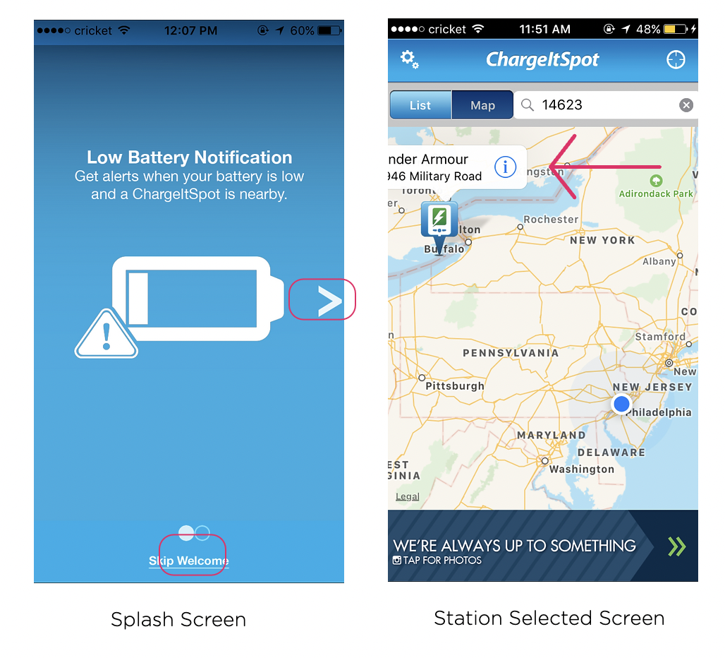
CUSTOMIZED ALERTS
User can personalize the low power mode according to their need. In iPhone, the user gets a by default notification on 10% & 20% but you cannot set the battery percentage.
Chargeitspot application's main feature gets an improved experience where the user gets a notification if there's phone battery is low and any station is nearby.
Now user can also turn off the repeating notifications and can also set the distance.
04. Deliver
Play with Prototype
Design iterations after user testing
PLAY WITH PROTOTYPE
DESIGN ITERATIONS AFTER USER TESTING
Confused Map Screen
Issue: Users weren’t sure what the transparent, semi transparent, and full markers meant?
Solution: Numbers are showing to each marker which represents how many lockers are available.
Issue: Also, if you see the menu, memory option has been removed from the navigation due to some change in the business requirements. It can come in the phase 2 as it is not aligning with the business requirement

New pop-up windows
The green color in the background tells the user that's it's open.
The red color is for the closed station.

List screen found clumsy
Issue 1: Users struggled with our list screen because they got confused with the arrow icon which represent compass.
Issue 2: Users mentioned that there is too much of information and colors on one screen.
Solution 1: Animated compass removed to get more space. Also, station hours shifted towards the right so that the user don't get confused with the number of lockers.
Solution 2: Unnecessary colors are removed and made it more cleaner. Now user can see lockers availability and station is open or closed easily.

Thanks for looking!
Here are my other projects
-

Unemployment benefits for US State Government
-

North Star Vision for an Insurance company
-

Wegmans- Point of Sale Redesign
-
ChargeItSpot - Redesign of a mobile application